Z I C O C O C O N U T W A T E R

The story of Zico coconut water starts in Central America, then goes on to live in Thailand, Indonesia, and the Philippines. So when designing the logo, one word came to mind: tropical. Coconut water is playful, too. It's unique, and fun to taste. It's fresh and flavorful, and you feel great drinking it. I wanted the brand to represent this. Playful, fun, tropical, fresh.
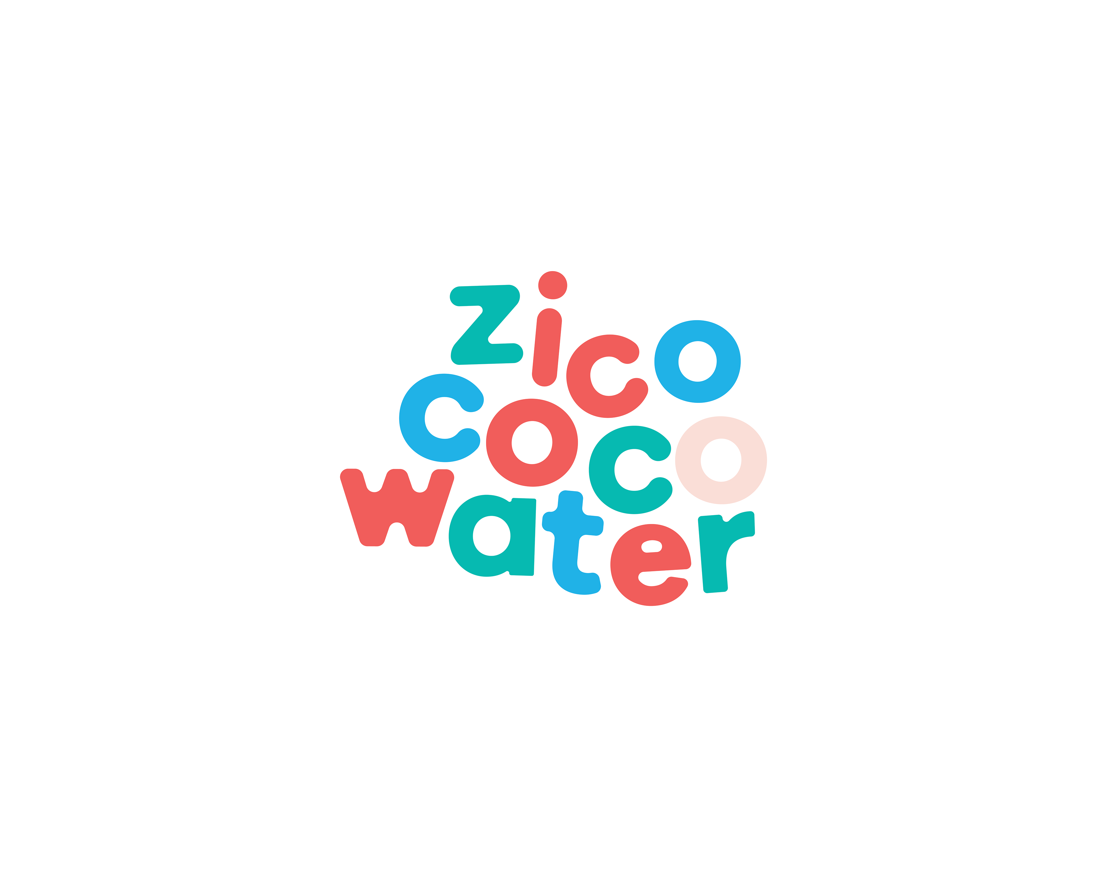
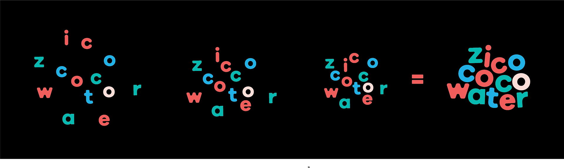
Making the Logo: With this project, I wanted to experiment with space. Coconut water is fresh, and playful. It's a unique drink with an acquired taste. I changed the name down to Zico Coco Water to make it memorable and playful. The spacing in letters was made by experimentation of moving letters.
The color palette choices were reminiscent of a tropical, but modern color choices. The fiery orange red and the sea green gives this palette a tropical feel while the light pink and navy blue give it a modern and playful twist.
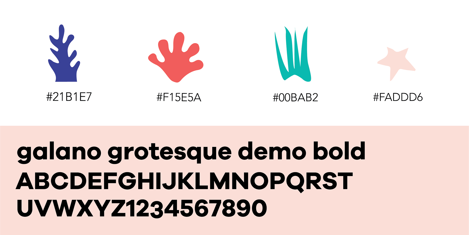
I rounded the corners of galano grotesque to eliminate the harshness of the edges and make it more soft.
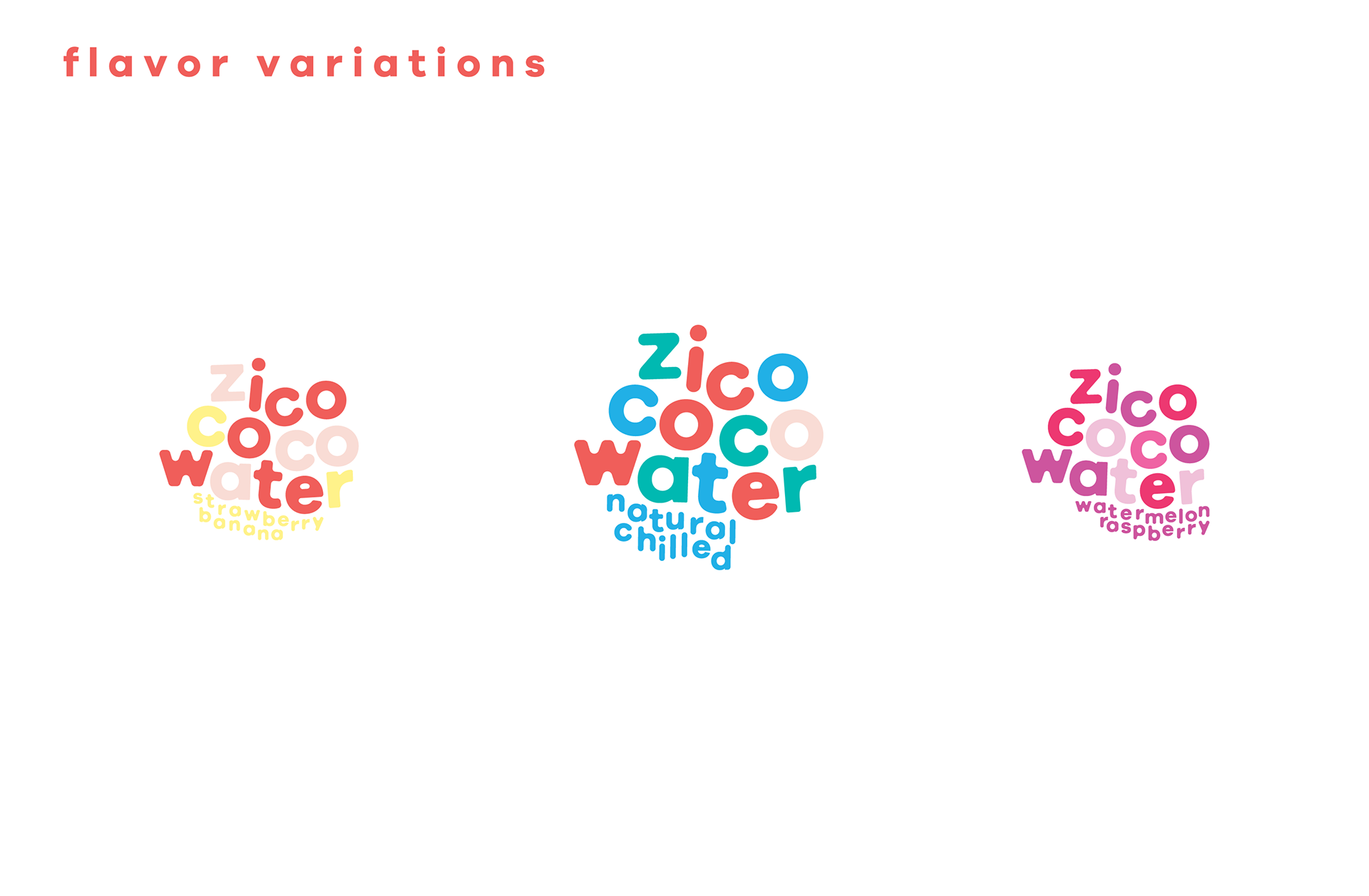
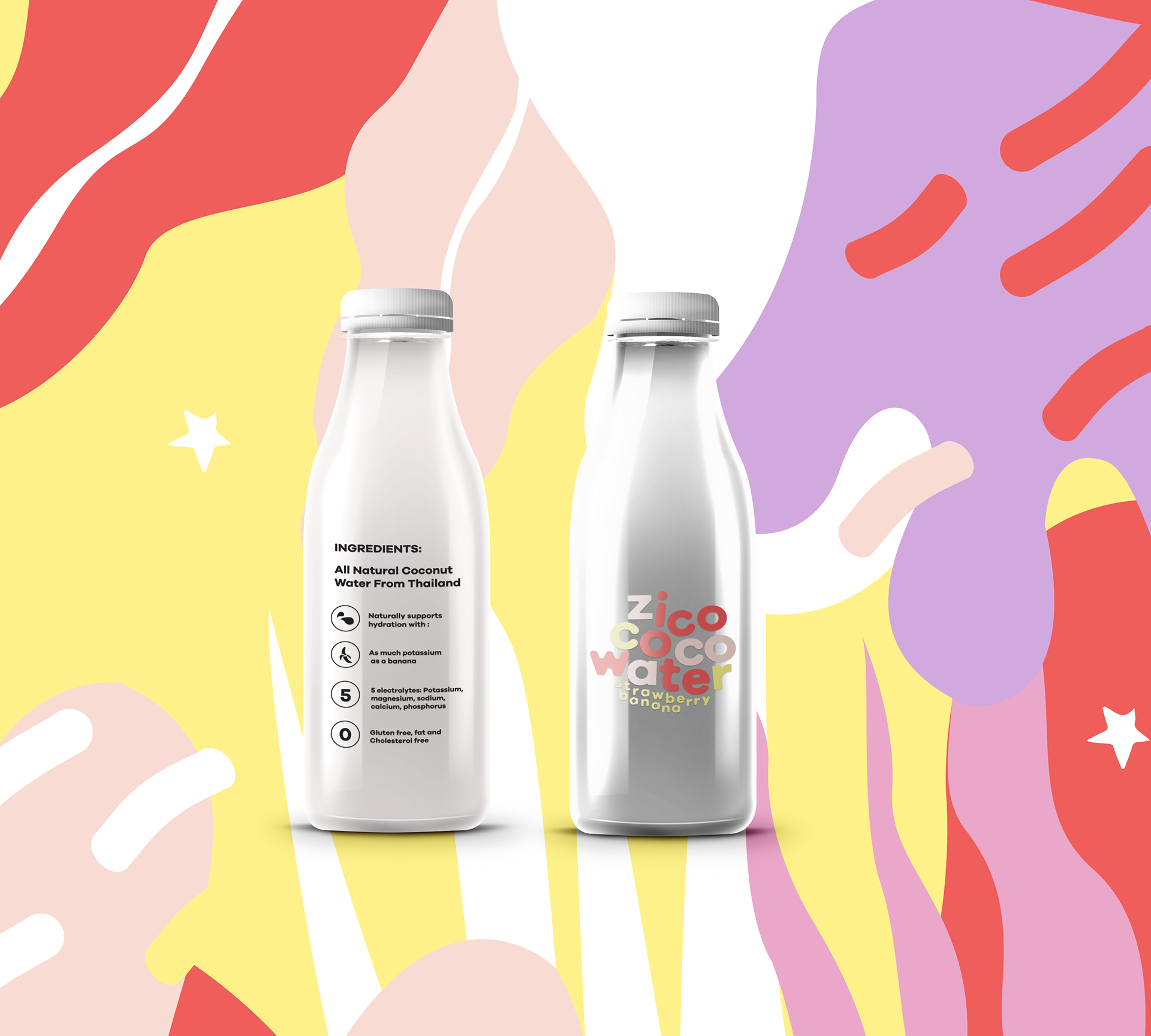
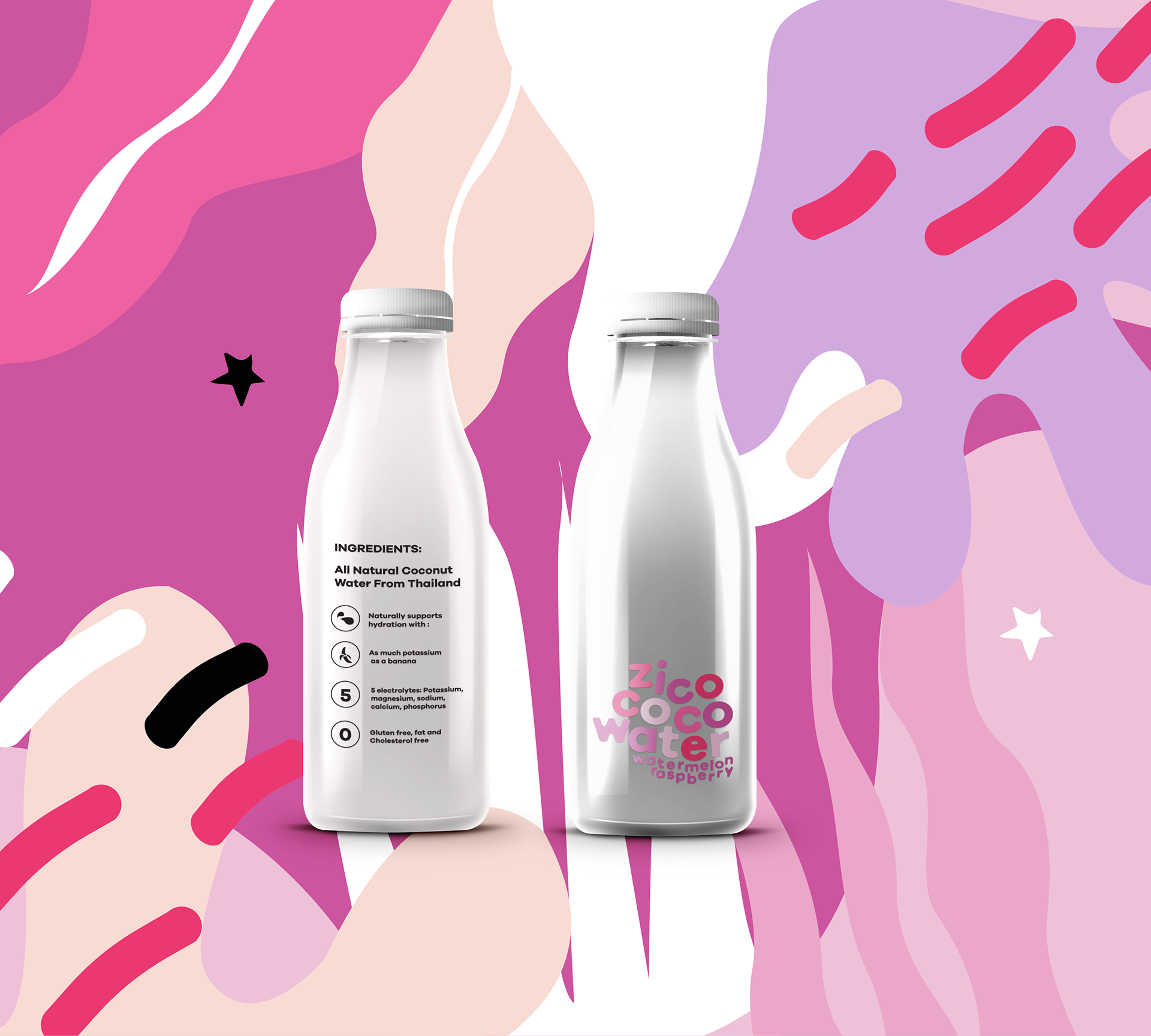
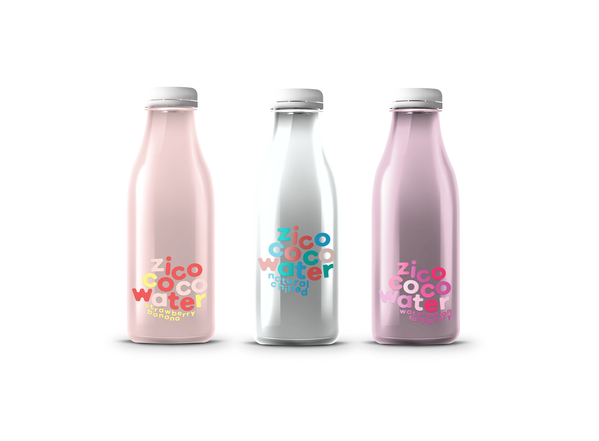
The three flavors for this branding include Natural Chilled, Strawberry Banana, and Watermelon Raspberry. The colors chosen for these flavors were inspired by the fruits in their true forms- yellows, and various shades of reds and pinks.
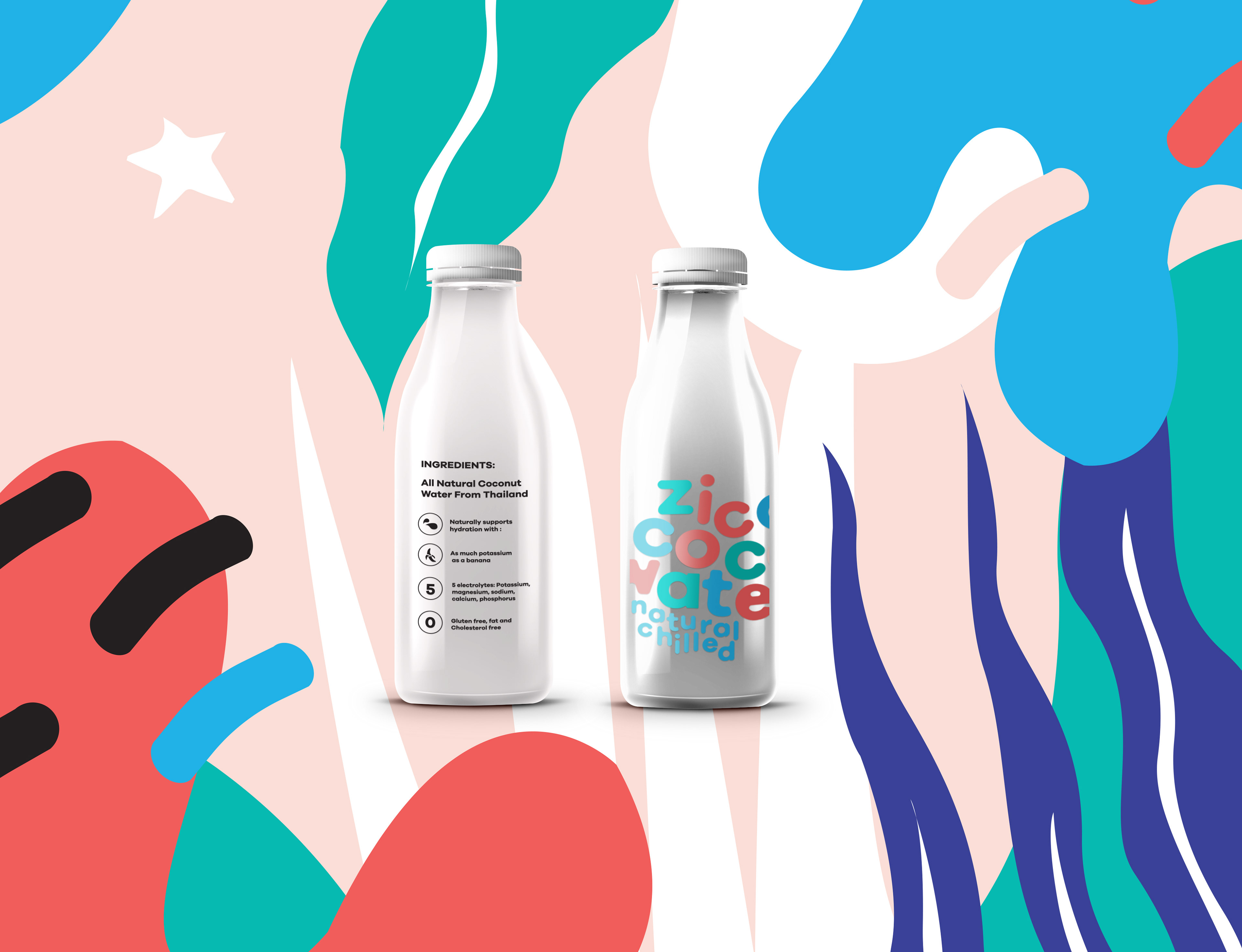
The following designs are the total bottle package for zico's 3 flavors. The logo is changeable. It can be used at any size, and 3 different positions on the bottle. As you can see throughout the designs, the logo's size changes. Zico's story is playful and fresh, and I wanted the bottles to be reminiscent of that.
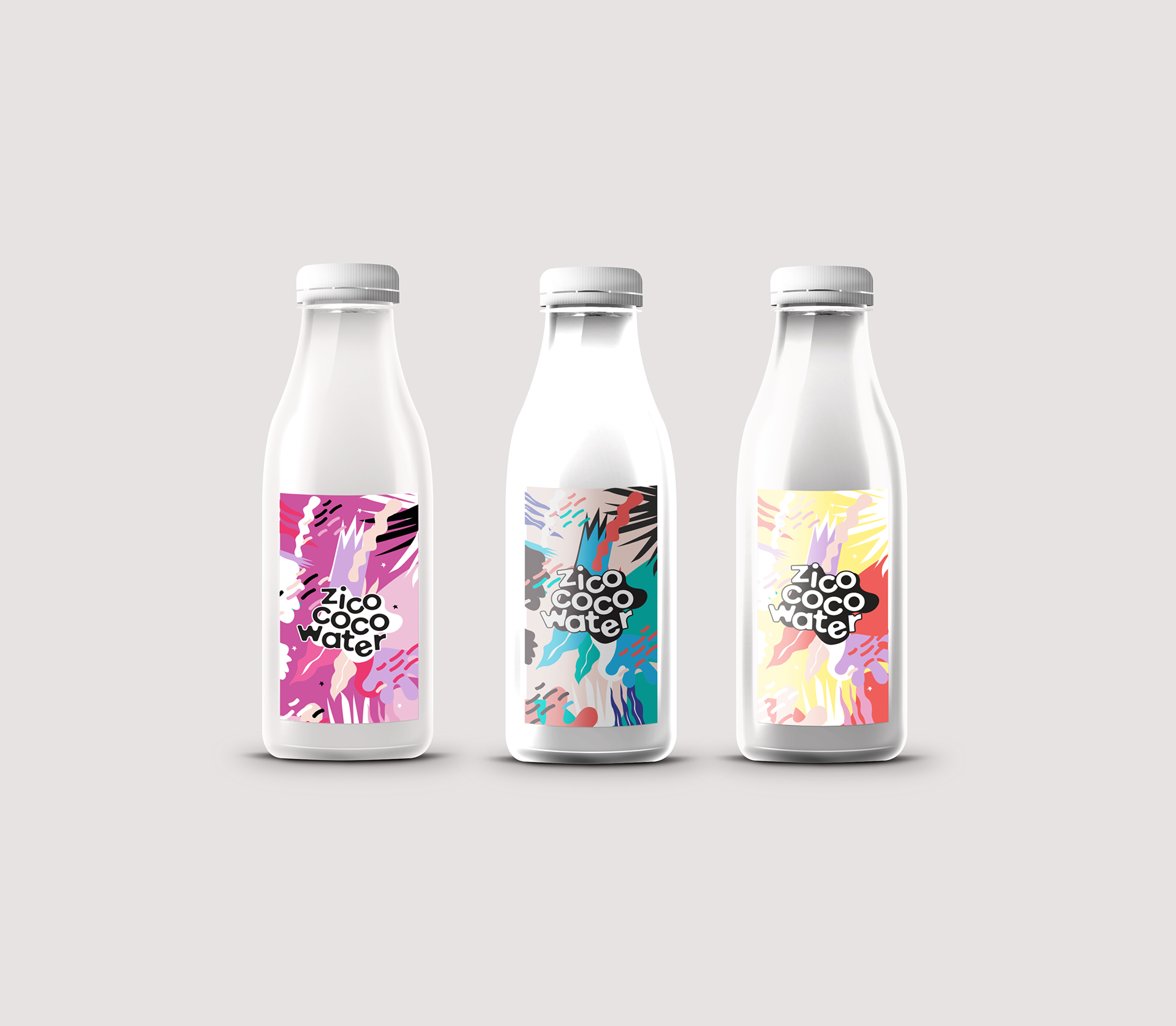
These are variations of packaging for Zico's coconut water that is only organic.
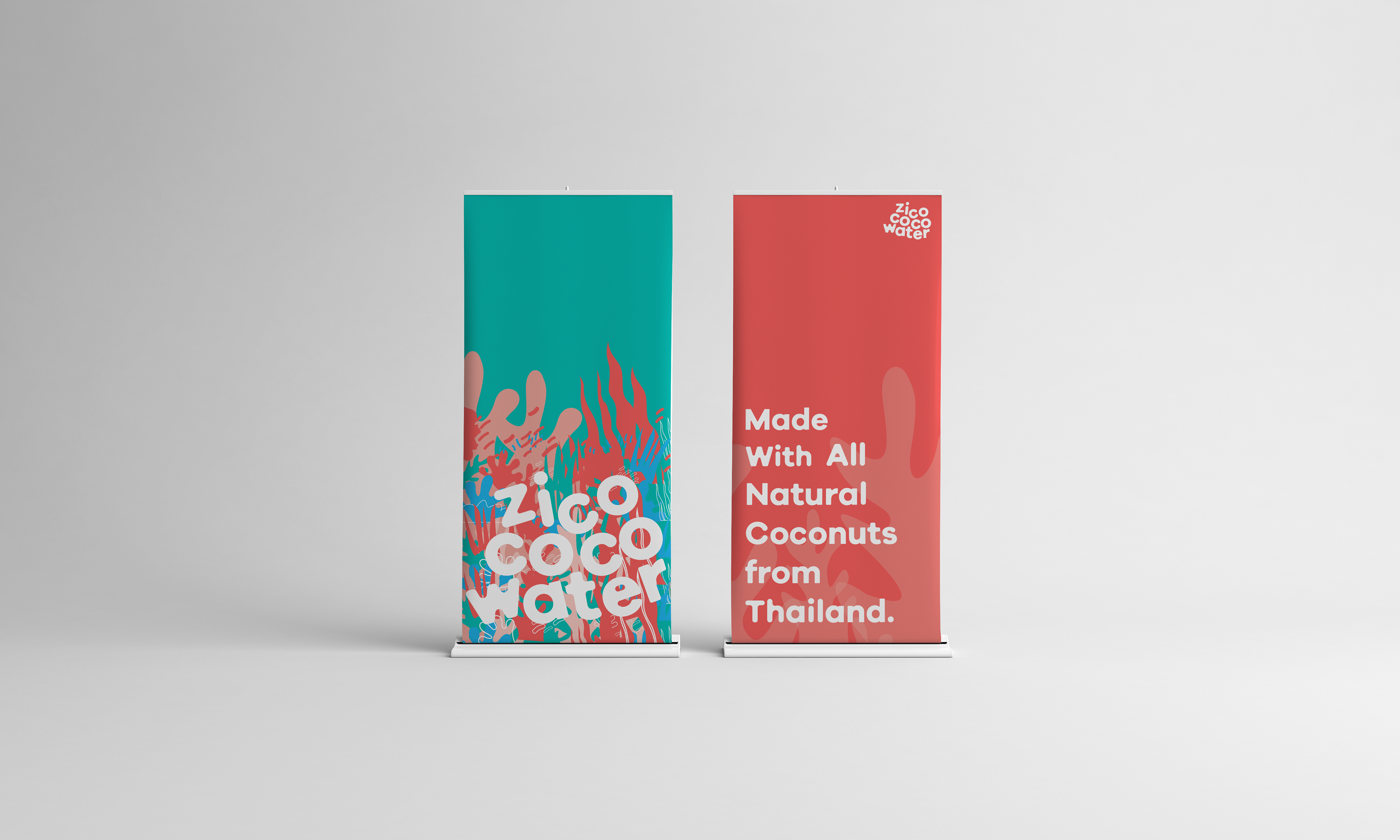
Tradeshow Banner- using the logo, only in white and giving it a new look but using the same design components to keep it consistent.
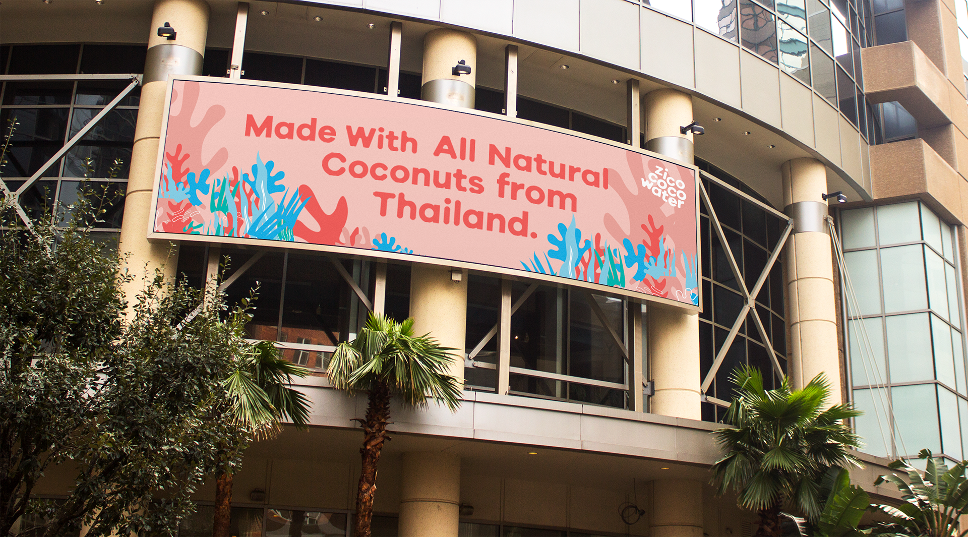
Example of a Billboard using Zico's consistent marketing design.